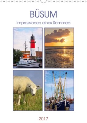
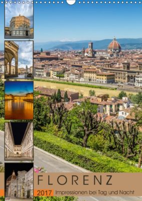
New: Design templates with title page layouts

Eye-catching covers are really important for successful calendars. We might have mentioned that before. (Ok, admittedly, we’re actually very fond of mentioning it). In order to support you in designing professional calendars that convince potential buyers “at a glance”, we have now introduced new and free of charge design templates for your use.

978-1-325-21962-9-cov

You’ll find the templates (for DIN formats only) in the Calvendo online editor in the bottom right corner under “calendar grids and design templates”. The layout of the images, font and font size as well as year on the cover are predefined and cannot be changed. You might find that restrictive at first, however, it’ll make it easier for you to create a visually more impressive cover. Plus, there’s still enough room for your creativity: You can, for example, choose individual colour moods for your images. Once you’ve added a picture/pictures, click on colours in the top right, then on one of the squares that show up below and then on “select colours”. A window will open up with a variety of colours for you to choose from and find the one that best fits your image(s).

978-1-325-21890-5-cov

Take a look at the calendar samples in this blog post that have all been created using our design templates: Give it a go and play around in the system! You can switch between different templates and try different options. Also, take a look at our step-by-step guide how to use the design templates. Our jury is looking forward to seeing your designs, and we hope the templates make creating calendars easier for you!

978-1-325-16921-4-cov

Should you have any problems/design questions when using the templates, please contact our support team on co.uk@support.calvendo.com.

How to make an impact with your cover

Never underestimate the power of your cover, we say! We can’t stress it often enough but your calendar cover is vital for making your product a success. It is the most important element of your calendar – and a selling point. The image you choose for your cover therefore needs to be convincing, as does your title and subtitle (if you choose one), font and overall design of the cover.

Take your time designing a good cover!

It’s worth pondering about this a bit because the cover is your unique chance to attract attention to your calendar and make people who’re searching on Amazon & Co stop in their track. After all, you’ve got a lot of competition, so make sure that your cover exemplifies why your calendars is worth buying and special.

We’ve got a few cover design tips for you. Here it goes:

Choosing the right cover image

A few things you should consider when choosing your cover image:

  • Use an image with a clear and striking central motive that visualises your calendar’s topic well.
  • Make sure that your image represents your calendar in its entirety (and not just part of it).
  • Work with an image that catches peoples’ eyes, makes them curious and interested in your calendar.
  • Choose an image that provides you with enough space to place your title in a large font that can easily be read.
  • Your cover image should be of high quality, i.e. a really good image that shows the craft of photography (or any other art form you might be working with).

Important design criteria

  • Your title font needs to be big enough so that it can still be read on the small thumbnail images used on online shops.
  • Make sure that that there is a high contrast between font and background colour, e.g., choose white or a light colour for your title font if the background is fairly dark.
  • Should you work with a collage for your cover image and combine several images, don’t use more than six; otherwise, everything gets to small and fiddly.
  • Work with image detail! Simply plonking a motive in the middle can be boring. Everything you ever learned about photography and composition also applies to calendar covers. (Just a reminder: top 10 photography composition rules)

Don’t forget: You’ll make our jury happy if you pay attention to your cover 🙂 And your calendars will also definitely make more of an impact and attract potential buyers.

If you use a picture editing software, you can also create a jpg for your cover and upload it on the system when creating your calendar. Plus, here’s a cover design video tutorial on our Calvendo YouTube channel.


Merry Christmas everyone!

24_Adventskalender-2015-SQ_GB_24-2

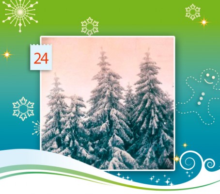
24th December, final day of our Calvendo Advent calendar 2015. All that’s left to say now is: Have a very merry and wonderful Christmas everyone and enjoy it with family & friends! To put you in a peaceful and suitably snowy mood, our last door reveals one of Nadia Attura’s gorgeous pictures from her Nature in Art calendar. The award-winning and fine art photographer works with layers to texturise her work. We like the mood this creates, and hope you do, too!

Merry Christmas – Frohe Weihnachten – Joyeux Noël – Buon Natale – Feliz Navidad