Practical tips for calendar self-publishers

In need of practical tips and information on calendar publishing? Here’s a bunch of handy links then:

How to make an impact with your cover

Never underestimate the power of your cover, we say! We can’t stress it often enough but your calendar cover is vital for making your product a success. It is the most important element of your calendar – and a selling point. The image you choose for your cover therefore needs to be convincing, as does your title and subtitle (if you choose one), font and overall design of the cover.

Take your time designing a good cover!

It’s worth pondering about this a bit because the cover is your unique chance to attract attention to your calendar and make people who’re searching on Amazon & Co stop in their track. After all, you’ve got a lot of competition, so make sure that your cover exemplifies why your calendars is worth buying and special.

We’ve got a few cover design tips for you. Here it goes:

Choosing the right cover image

A few things you should consider when choosing your cover image:

  • Use an image with a clear and striking central motive that visualises your calendar’s topic well.
  • Make sure that your image represents your calendar in its entirety (and not just part of it).
  • Work with an image that catches peoples’ eyes, makes them curious and interested in your calendar.
  • Choose an image that provides you with enough space to place your title in a large font that can easily be read.
  • Your cover image should be of high quality, i.e. a really good image that shows the craft of photography (or any other art form you might be working with).

Important design criteria

  • Your title font needs to be big enough so that it can still be read on the small thumbnail images used on online shops.
  • Make sure that that there is a high contrast between font and background colour, e.g., choose white or a light colour for your title font if the background is fairly dark.
  • Should you work with a collage for your cover image and combine several images, don’t use more than six; otherwise, everything gets to small and fiddly.
  • Work with image detail! Simply plonking a motive in the middle can be boring. Everything you ever learned about photography and composition also applies to calendar covers. (Just a reminder: top 10 photography composition rules)

Don’t forget: You’ll make our jury happy if you pay attention to your cover 🙂 And your calendars will also definitely make more of an impact and attract potential buyers.

If you use a picture editing software, you can also create a jpg for your cover and upload it on the system when creating your calendar. Plus, here’s a cover design video tutorial on our Calvendo YouTube channel.


Eight Calvendo authors winners in Gregor Self-Publishing Calendar Award 2016 competition

Time to congratulate a few people: Eight Calvendo self-publishers have won prices in the prestigious Gregor International Calendar Award 2016. Well done! The awards ceremony took place in Stuttgart last week and everyone looks very happy, don’t you think:
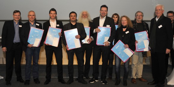
Copyright: Udo W. Beier

Copyright: Udo W. Beier

The international Gregor award was launched in Stuttgart in 1950 in order to showcase calendar creations in Germany and abroad. Participants can each year submit calendars on different subjects and altogether 1026 calendars from Germany, other European countries, Japan and Israel were evaluated by the jury for the 2016 awards. For the first time, the growing importance of self-publishing was recognised by adding a whole new category for self-published wall calendars. Which we, at Calvendo towers, obviously very much applaud and it’s great to see our users showcasing their work and being awarded for their creative efforts! Altogether ten prices were handed out for the Gregor Self-Publishing Calendar Award 2016 and here are the eight Calvendo winners:

Klaus Eppele: Natur pur (travel/landscapes category)

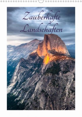
Florian Westermann: Zauberhafte Landschaften (travel/landscapes category)

Marcus Bayer: Architektur – 126 Grad (cities/architecture category)

Eberhard Ehmke: Komm doch näher … (animals category)

Beat Frutiger: Fremde Wesen (art/culture category)

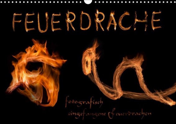
Kamran von Kleist: Feuerdrachen (art/culture category)

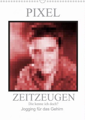
Manfred Zimmermann: Pixel Zeitzeugen (art/culture category)

Beate Gube: Amerikanische Schönheiten aus Stahl (technology/transport category)

______________________________________________________________________

Covers of the Calvendo calendars receiving the Gregor Self-Publishing Calendar Award 2016:
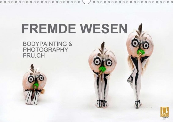
Beat Frutiger: Fremde Wesen, awarded in art/culture category as well as jury price

Beat Frutiger: Fremde Wesen, awarded in art/culture category as well as jury price

Klaus Eppele: Natur pur, awarded in travel/landscapes category
Klaus Eppele: Natur pur, awarded in travel/landscapes category

Florian Westermann: Zauberhafte Landschaften, awarded in travel/landscapes category

Florian Westermann: Zauberhafte Landschaften, awarded in travel/landscapes category

Marcus Bayer: Architektur – 126 Grad, awarded in cities/architecture category

Marcus Bayer: Architektur – 126 Grad, awarded in cities/architecture category

Eberhard Ehmke: Komm doch näher …, awarded in animals category
Eberhard Ehmke: Komm doch näher …, awarded in animals category

Kamran von Kleist: Feuerdrachen, awarded in art/culture category
Kamran von Kleist: Feuerdrachen, awarded in art/culture category

Manfred Zimmermann: Pixel Zeitzeugen, awarded in art/culture category

Manfred Zimmermann: Pixel Zeitzeugen, awarded in art/culture category

Beate Gube: Amerikanische Schönheiten aus Stahl, awarded in technology/transport category

Beate Gube: Amerikanische Schönheiten aus Stahl, awarded in technology/transport category